By Zuben Bastani
•
June 17, 2025
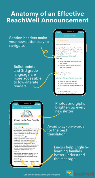
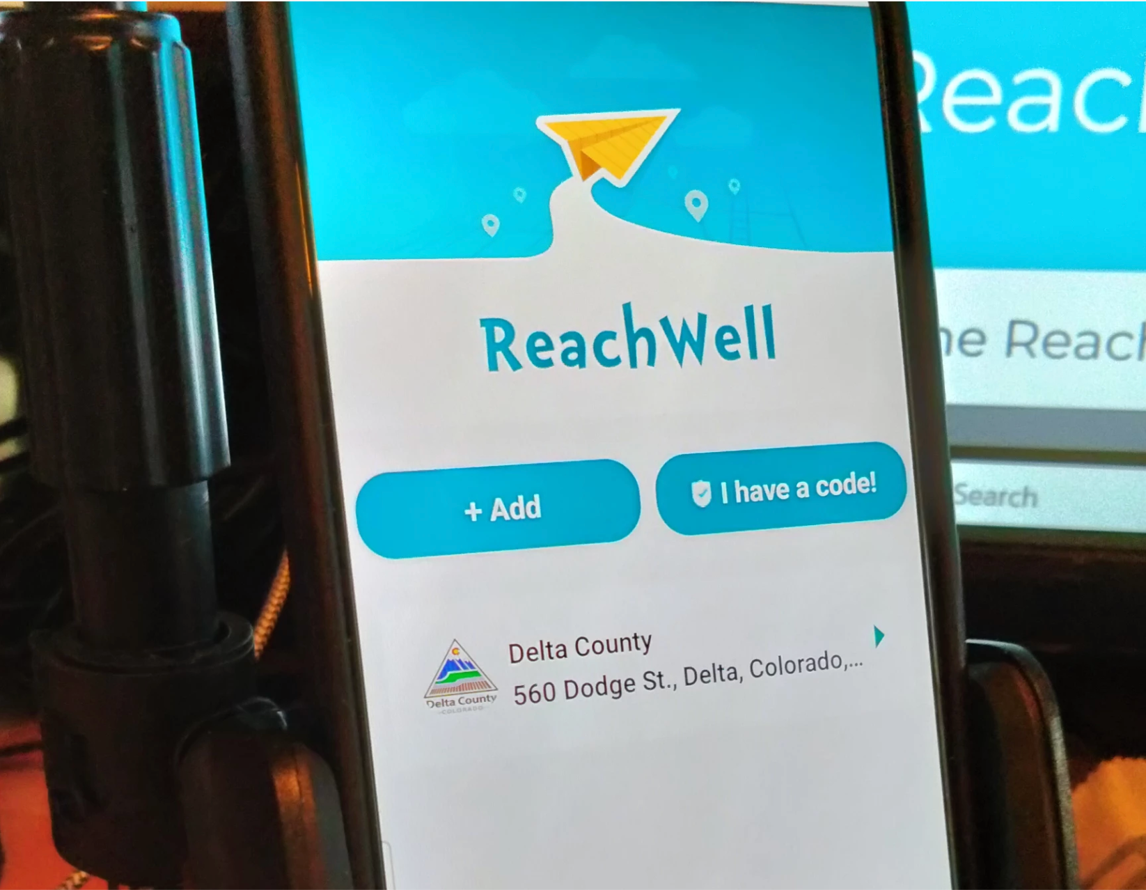
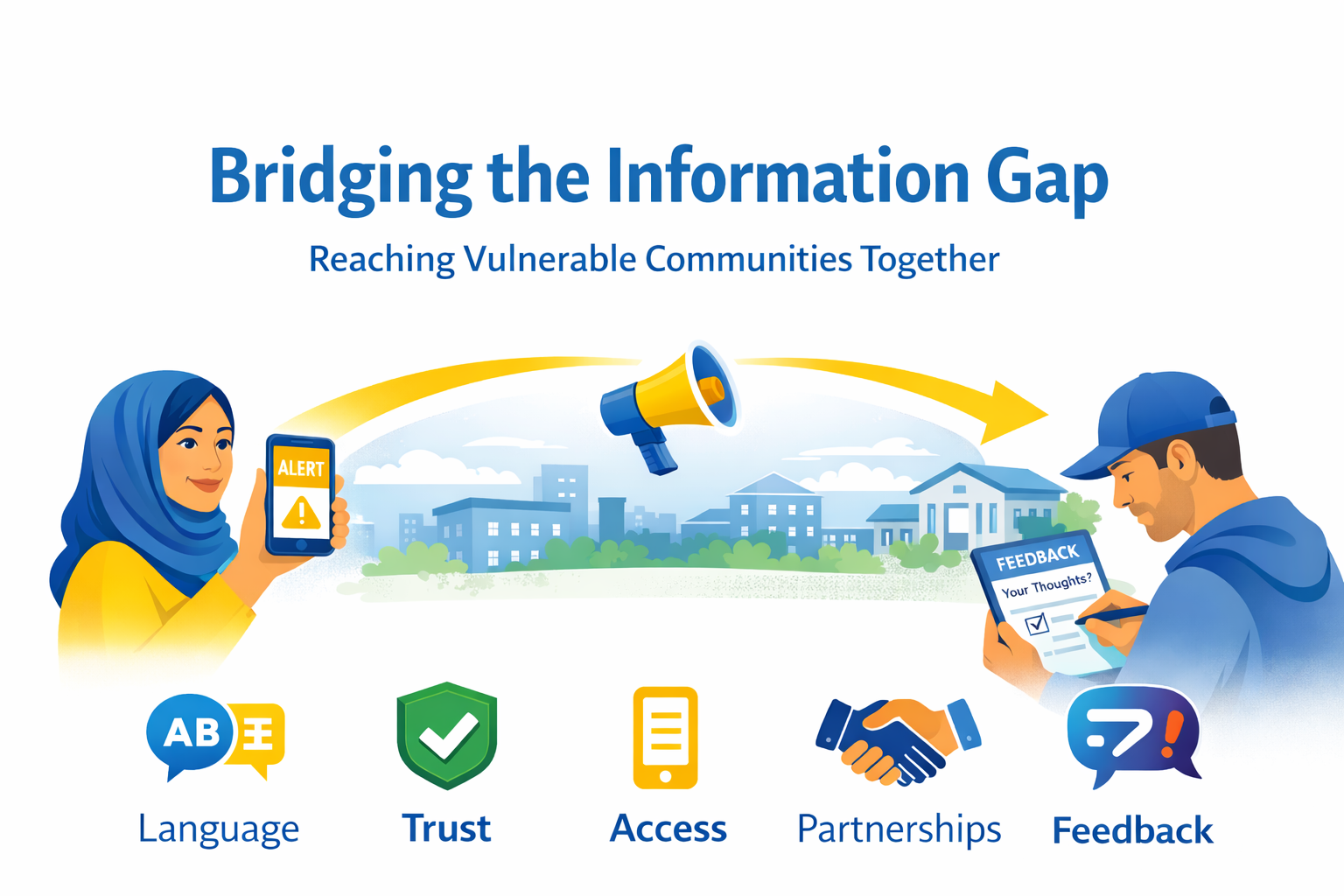
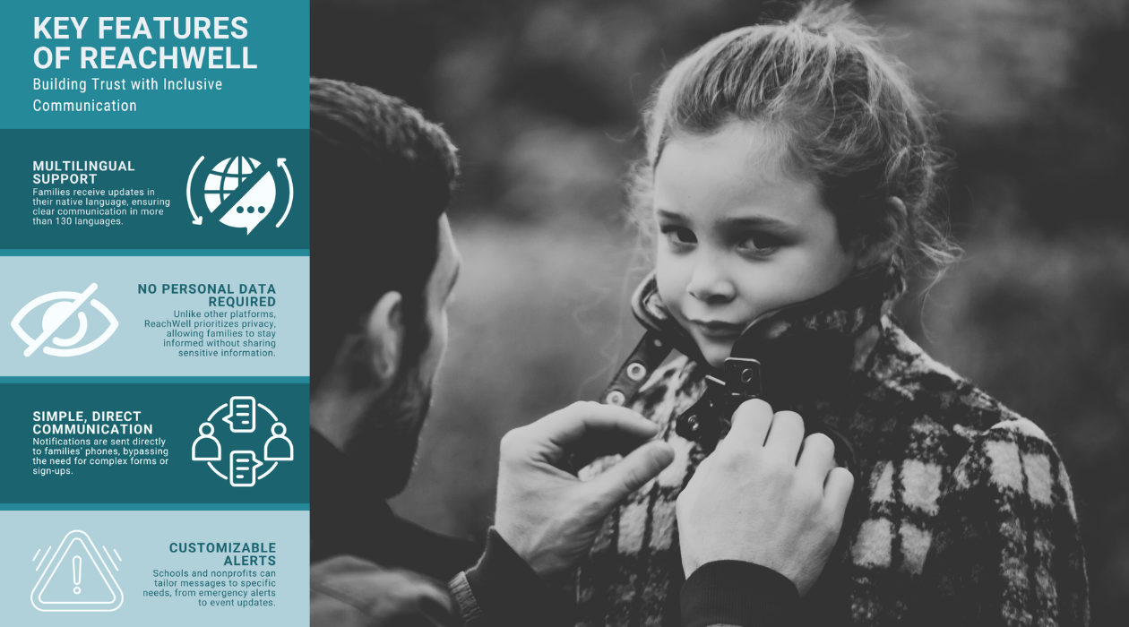
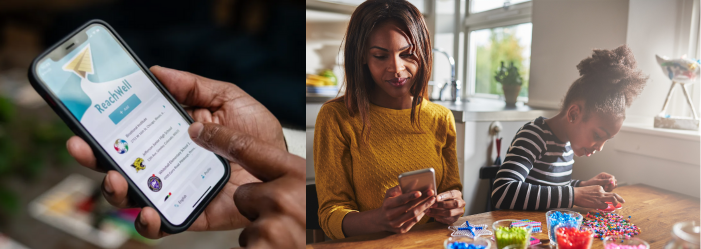
Government distrust is at an all-time high. Many residents are wary of sharing their personal information with public agencies, often due to fears of surveillance, spam, or data misuse. This hesitation is especially acute among low-income and unhoused individuals who frequently change phone numbers due to service lapses, making traditional outreach efforts ineffective. Most public communication systems fall short. They rely on platforms like Mailchimp or Constant Contact, which get lost in crowded inboxes. Social media, while pervasive, is designed to harvest data and push ads—not to protect user privacy. Even emergency alert systems often require residents to sign up and share their location, further eroding trust. Text messaging, often called the holy grail of communication, is no longer a guaranteed solution. People guard their phone numbers carefully, especially when interacting with the government. They fear being spammed or having their data sold. So how can agencies inform and protect the public without breaching their trust? A New Approach to Community Communication Using ReachWell's extensive experience and broad customer base, here are some recommendations to consider when engaging your community in a less intrusive yet more effective manner: Offer Communication Choices : Let residents decide how they want to receive information—whether it's through text, email, voice calls, app notifications, or a combination. This respects personal preferences and helps reduce message fatigue. Respect Anonymity : Not everyone wants to share personal contact details. Provide anonymous access to messages via public channels or apps that don’t require identifying information. Support Multilingual Access : Language should never be a barrier to safety or services. Translate messages into the primary languages spoken in your community, and consider text-to-speech options for low-literacy audiences. Allow Topic Subscription : Let people select specific topics or groups they care about. Targeted messages reduce noise and increase engagement. Minimize Data Collection : Collect only the data you truly need. Avoid tracking location or behavior unless absolutely necessary—and be transparent about what is collected and why. Ensure Accessibility : Meet or exceed accessibility standards (such as WCAG 2.2 AA compliance) so all residents, including those with disabilities, can access and understand public messages. These practices foster trust, improve message delivery, and help ensure no one is left out of important conversations—especially in moments of crisis or community need. Expanded Real-World Examples: Trusted by Diverse Communities El Paso County, CO (Colorado Springs area) uses ReachWell to distribute emergency alerts—including shelter-in-place orders and missing persons reports—in over 130 languages. Residents can receive alerts even without providing contact information. The Town of Carbondale, CO keeps its multilingual and low-literate residents informed of community events, social services, and public works projects using WCAG 2.2 AA-compliant messaging and text-to-speech capabilities—ensuring no one is left behind. Tucson, AZ : Child-Parent Centers, a Head Start provider, uses ReachWell to keep 500+ staff updated on safety alerts, training sessions, and HR notices across 130 languages—building internal trust through inclusive communication. Boulder County Housing Authority ensures ongoing connection with residents—even after their contact information changes—by sending updates about emergencies, upcoming maintenance, and resident services using ReachWell’s multilingual and anonymous outreach tools. Conclusion Building trust with residents starts with giving them control. When governments let people choose how they connect, what they receive, and in what language—trust grows. ReachWell is proving that communities can be kept safe and informed without sacrificing privacy or accessibility. When people don’t trust the system, it’s time to change the system. ReachWell is doing just that. BOOK A DEMO TODAY